Using Microsoft Excel
For Linear Regression Analysis
Introduction | Plotting Basic | Excel Example1 | Excel Example2 | Assignment |
A very effective way to organize the information such that trends, relationships or extrapolation can be made by presenting data taken from an experiment in a well illustrated graph. It is therefore very important to know how to tabulate data and illustrate the information graphically. Linear regression (linear analysis) or other mathematical analysis can be used to extract pertinent information, i.e., slope of line and y-intercept. Introduction:
Data that is best represented graphically are those in which one variable is controlled and the other measure. It is best to obtain the data in table form and then to graph the measured property on a set of perpendicular axes. The independent variable is plotted along the horizontal x-axis or abscissa with the dependent variable plotted long the vertical y-axis or the ordinate.
The steps are:
Select the Axes - The first step is to choose the variable that will represent the abscissa and which will represent the ordinate. Each axes should be properly labeled
Set the Scales for the Axes - The graph should be constructed such that the data fills as much of the graph paper as possible. It is important to choose the scales of the x and y axes such that it covers the range of the data. When choosing the scale, it is important to choose values for the major division that make the smaller subdivision easy to interpret. Note that the values of the axes do not have to begin at zero at the origin. Furthermore, the size of the minor subdivisions should permit estimation of all the significant figures used during the experiment. Finally, if the graph is used for extrapolation, the range of the scale covers the range of the extrapolation.
Plot the data - Dots are place for each data point at the appropriate place in the graph. A small circle is then drawn around each dot with the size of the circle approximating the error in the measurement. If two or more different data set is plotted on the same graph, different shaped symbols (triangle, square, diamond). are used to distinguish one set of data from the other.
Draw a Curve of Best Fit - A smooth curve that best fit the data is drawn through the points. The line generally does not pass through the centers of all the data points but passes as close to all data point.
Label the Graph - A descriptive title is added to the upper portion of the graph. A legend is included at the lower portion of the graph as needed.
Plotting by Hand
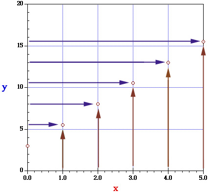
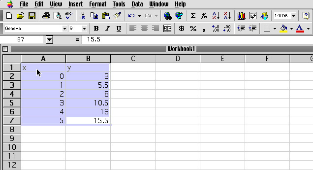
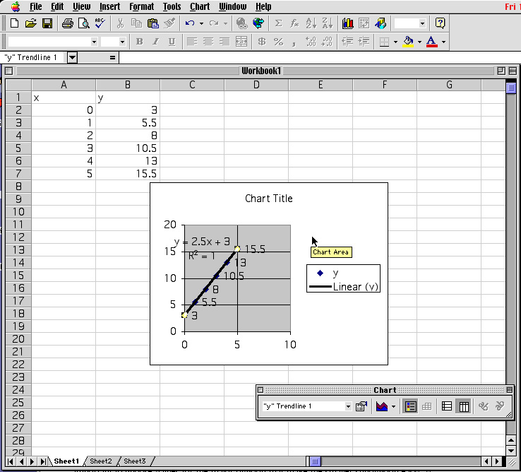
Functional relationship between two variables can always e represented graphically. Ordinarily, the vertical axis represent the dependent variable - y, and the horizontal axis represents the independent variable -x. Consider the equation: y = 2.5 x + 3.0. In the region x = 0 and x = 5, the values of y can calculated using x = 0, 1, 2, 3, 4 and 5:
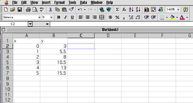
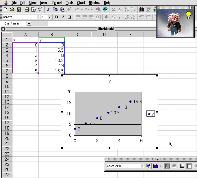
x 3.0 5.5 8.0 10.5 13.0 15.5 y 0 1 2 3 4 5 Each of these points can be located on a graph as follow: The fist point (x=0, y=3.0) is located on the y axis (x=0), three units above the origin (y = 3.0). The second point (x=1, y=5.5) is located by moving out one unit horizontally from the origin (x=1) and then moving 5.5 units vertically (y=5.5). The graph which result when the six points are located in this manner is shown below.
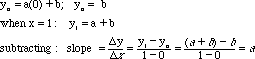
A plot of the function y = 2.5 x + 3.0 is a straight line which cuts the y axis at 3.0. This value ( x=0 and y=3) is also called the y-intercept. The slope of this line may be found by dividing the difference between final and initial values of y by the difference between the corresponding x values.
In conclusion for slope for the equation given above has the slope 2.5 and a y-intercept (the value of y when x=0) is 3.0. In general the graph of the equation:
is a straight line with a slope of a and an intercept of b. To show that this is the case, we can adjust the values of x to equal 0 and solve the equation-
y = a x + b Back to Top
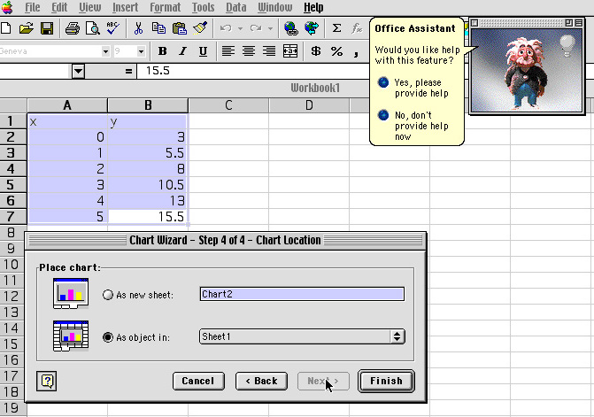
Plotting Using Excel
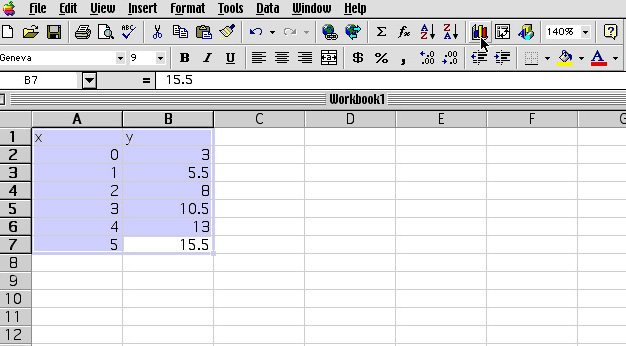
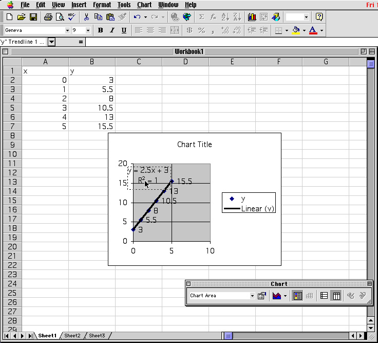
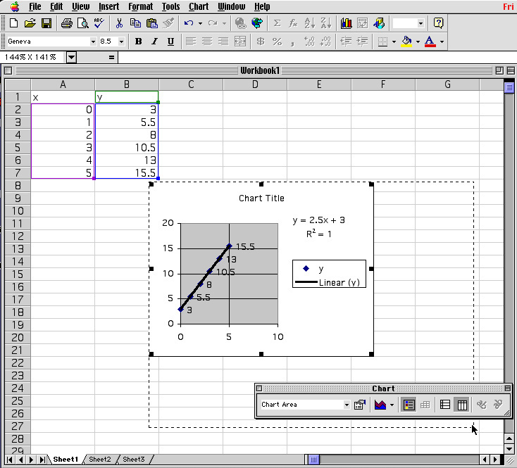
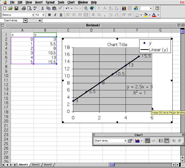
In the next sequence, the Microsoft Excel spread sheet program is used to solve the same problem discussed above.
As shown above the Excel spread sheet can be used to option a graph of best fit using the chart command and the trend line function.
Back to Top
Example 2:
i) Calculate the activation energy for the acid hydrolysis of sucrose from an Arrhenius plot of the following dataii) Calculate the rate constant at 37° C (body temperature)
Temperature °C k, Lñmol-1ñs-1 24
28
32
36
404.8 · 10-3
7.8 · 10-3
13 · 10-3
20 · 10-3
32 · 10-3Background Information: The relationship between the activation energy as a function of temperature is established by the Arrhenius equation which has the formwhere,
k =Aexp(Ea/RT)
k is the rate constant for the reaction
A is the pre-exponential factor
R is the universal Gas Law constant = 8.314 J/ mol*K
T is the temperature in kelvin
Ea is the activation energy for the reaction consideredTaking the natural log of equation 1 and expanding the Arrhenius equation to
gives a familiar form of a line:
lnk = lnA -Ea/RT where
y = b + mx (Eqn3)
y = lnk
b = lnA
m = -Ea/R
x = 1/T.i) Therefore for the problem above, a plot of lnk vs 1/T will yield a slope equal to -Ea/R which is used to calculate the activation energy for the reaction.
ii) Using the activation energy determine from part i, the values of Ea and T( 37°C + 273) into Eqn 1 to determine the rate constant.
1 The Data is typed into the Excel spread sheet program in cells . Cell A1 and B1 are used as the heading. Cells A2-A6 are the temperature in °C and B2-B6 are the rate constant values.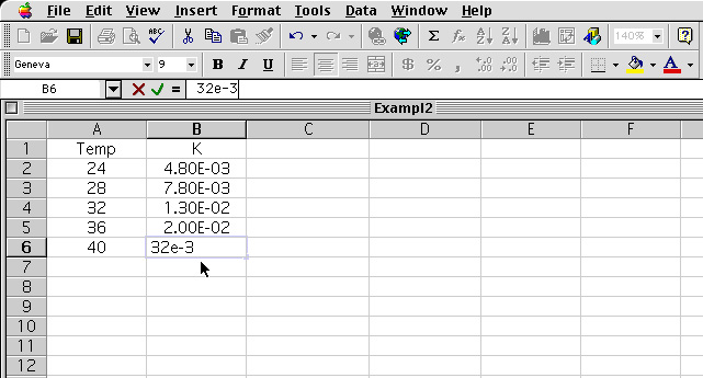
2 The equation is typed into cell C2. Upon entering "Return" the value is tabulate.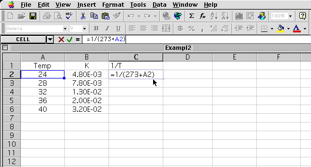
3 The cell C2 result is high lighted and the corner of the cell is drag down to tabulate the rest of the values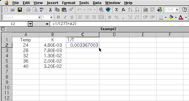
4 The corner of cell C2 is dragged down to C6 and the pointer is release. 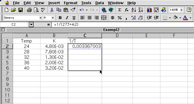
5 The resulting values is tabulated for cell C3 to C6. 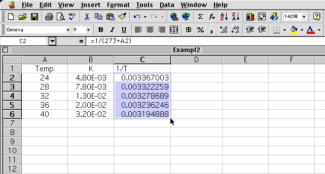
6 The equation for the ln K is entered in cell D2. 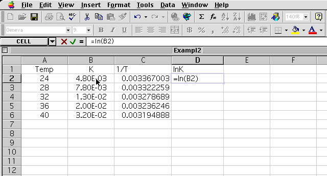
7 The resulting values for D2 to D6 is tabulated 
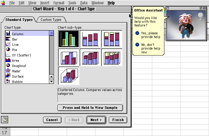
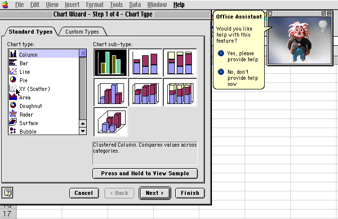
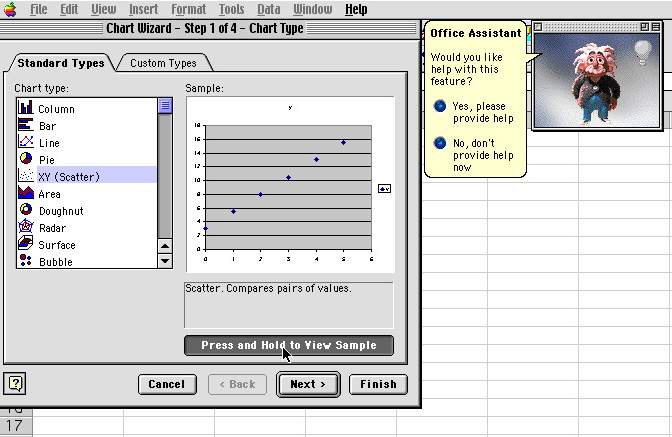
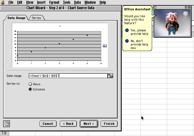
8 The values in Cell C2-C6 and D2-D6 are high lighted and the Chart Wizard is selected 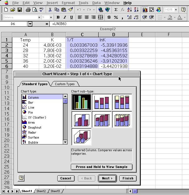
9 Going through the Chart Wizard the graph is obtain for the data. 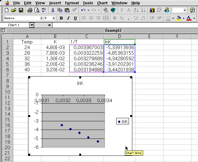
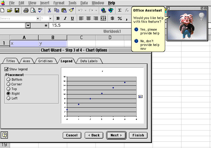
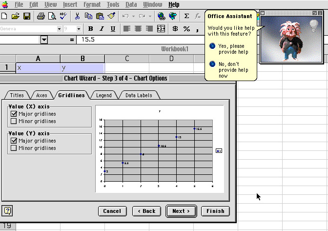
10 The resulting graph is adjusted to maximize the area. This is done by grabbing the handle of the graph and sizing accordingly. 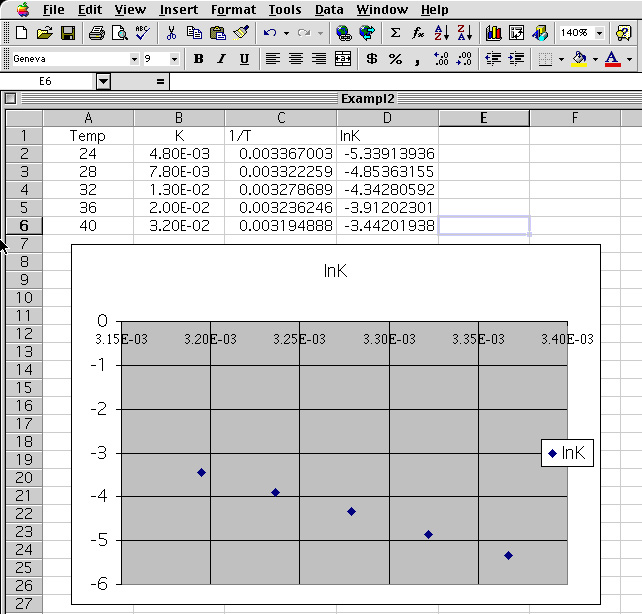
11 The scale can be adjusted by "clicking" on the y-axis 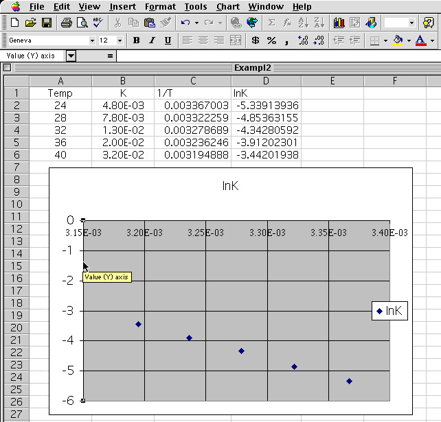
12 The Format axis menu is shown. The font is changed to "Times" and the "Scale" button is selected. 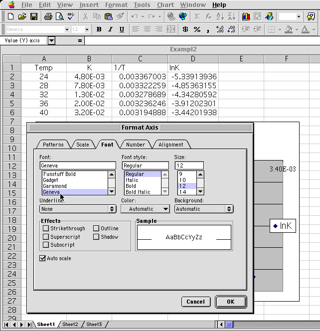
13 The scale for the graph is adjusted so that the Maximum range is -3. 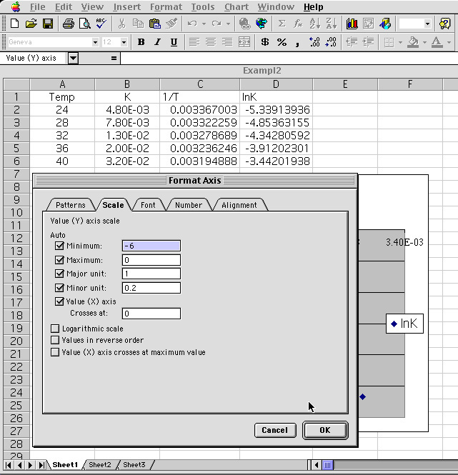
14 The result is a graph that maximizes the graph to the data point. Next the data points on the graph is selected. 
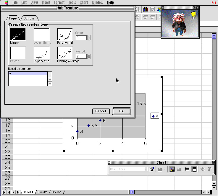
15 Upon high lighting the data point, the Tool menu is selected and the "Add Trend line" option is selected. 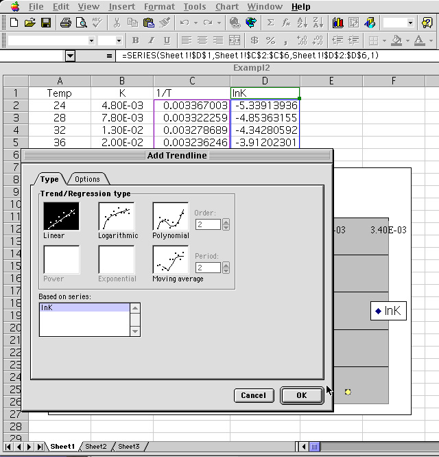
16 The "Option" menu is selected and the "Display equation on chart" and "Display r-squared value on chart" is selected. 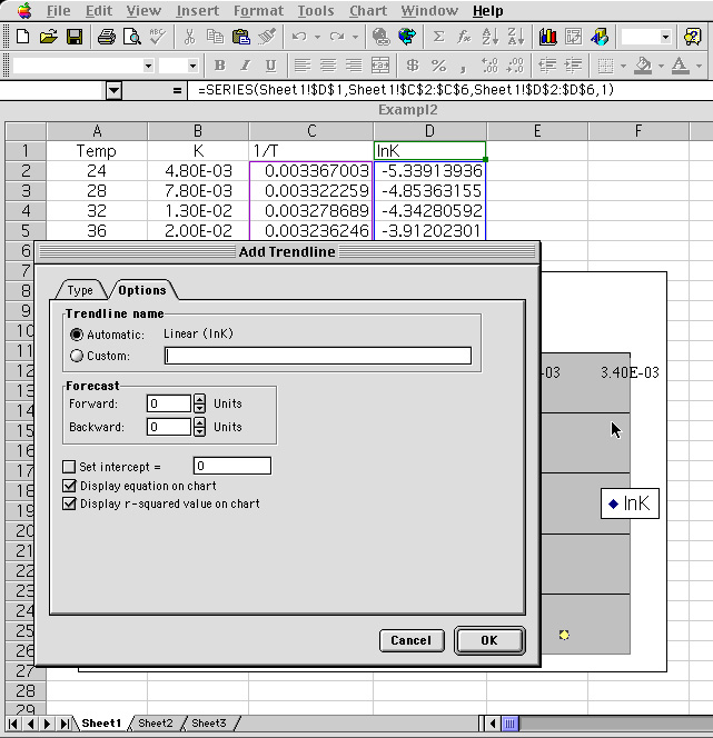
17 Going through the Trendline questioning the result is shown. 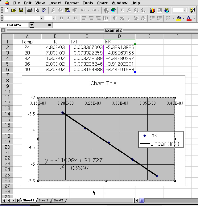
i) From the equation of the line: y = -11008 x + 31.727
the following information is determined.The y-intercept : lnA = 31.727 This gives the pre-exponential factor A = e(31.727) = 6.00981013ii) The Activation energy (Ea = 91520.5 J ) together with the natural log of the pre-exponential value (A = 6.00981013) is now used in the equation k =A exp(Ea/RT) , where T = 310K
The slope: m = -11008 which is equals -Ea/R.
Multiplying -11008 by -R (-8.314J/mol*K) yields Ea = 91520.5 J or 91.5 kJ.k = 6.00981013 exp {91520.5/(8.314310)} = 1.58681029
Assignment: Using the Excel spread sheet solve the two problems below. Turn in a hard copy of your results. Your graph should be properly labeled and the answers should have the correct units.Problem 1:
i) The rate of the reactionwas measured at several temperatures, and the following data were collected
CH3COOC2H5(aq) + OH- (aq) CH3COO-(aq) + C2H5OH (aq)
Using the data, construct a graph of the lnK versus 1/T. Using your graph, determine the values of Ea.
Temperature °C k, M-1 s-1 15
25
35
450.0521
0.101
0.184
0.332
Problem 2:
i) The rate for the rearrangement of methyl isonitrile at various temperatures is given in the table belowUsing the data, construct a graph of the lnK versus 1/T. Using your graph, determine the values of Ea.
Temperature °C k, ·s-1 189.7
198.9
230.3
251.22.52 · 10-5
5.25 · 10-5
6.30 · 10-4
3.16 · 10-3ii) What is the value of the rate constant at 430.0 K ?